R visualization: making boxplot with ggplot
December 15, 2021
Topics covered
Apart from the general way of producing boxplot, I’ll include the following modifications in this demonstration:
- convert numbers to hh:mm:ss or other time format in axis ticks
- recorder axis
- use jitters to show outliers
- add percentile and mean value annotations
Scenario
In order to demonstrate the advantage of using “jitters” to show outliers, we need to have a large number of records, ideally time associated (in order to demonstrate the time format conversion). Also, boxplot is best to be used to describe discrete non-categorical values. One scenario suitable is commute time records in different cities. The demographic differences make residences in different cities have different commute experiences everyday when they drive to work. People in a small town is likely to spend less time in driving to work, compared to these who live in large cities such as Toronto or Vancouver. Since the data is not available, we’ll need to make something up. Lets assume we have commute time collected from four cities: A, B, C, D. Their commute times have different characteristics:
- Commute time for all the four cities follow lognormal distribution (so that all possible values are non-negative)
- Maximum of commute time: A > B > C > D
- Mean of commute time: A > B > C > D
- Standard deviation of commute time: B > A > C > D
- Number of data points collected: A > B > D > C
make up commute time data
To generate a sequence of values that follow lognormal distribution, we use dlnorm(). This gives the probability density function of lognormal distribution. Suppose these values represent the travel time in seconds (hence we round them up to be integers)
set.seed(1000L)
ta <- round(rlnorm(7000L, meanlog = log(1800), sdlog = log(1.2)), 0)
tb <- round(rlnorm(14000L, meanlog = log(1200), sdlog = log(1.5)), 0)
tc <- round(rlnorm(800L, meanlog = log(1800), sdlog = log(1.3)), 0)
td <- round(rlnorm(3500L, meanlog = log(1800), sdlog = log(1.2)), 0)
With these commute time data (suppose the unit is seconds), we can compile them to be a data table for plotting:
df_commute <- data.table::data.table(city = c(rep('A', 7000L), rep('B', 14000L),
                                              rep('C', 800L), rep('D', 3500L)),
                                     commuteT = c(ta, tb, tc, td))
print(head(df_commute))
##    city commuteT
## 1:    A     1659
## 2:    A     1445
## 3:    A     1814
## 4:    A     2023
## 5:    A     1560
## 6:    A     1678
Basic boxplot
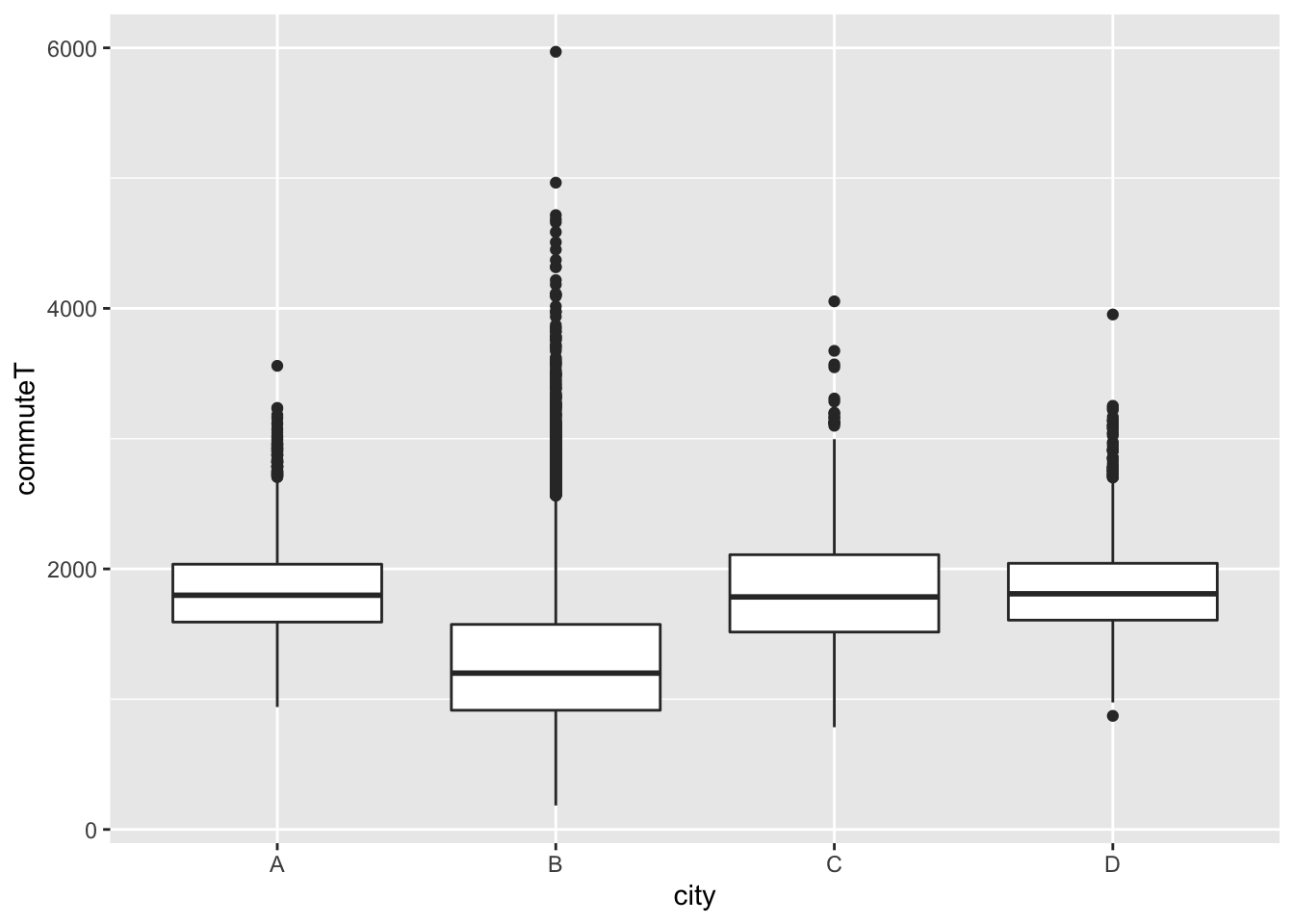
A very basic boxplot looks like the following. By deault, the upper whisker is the smaller value of the maximum value and Q3 + 1.5IQR, and lower whisker is the larger value of the minimum and Q1 - 1.5IQR. You can read more at this R-bloggers post.
ggplot(df_commute, aes(x = city, y = commuteT)) +
        geom_boxplot(notch = F) # default is F, but include here as an option
add jitters
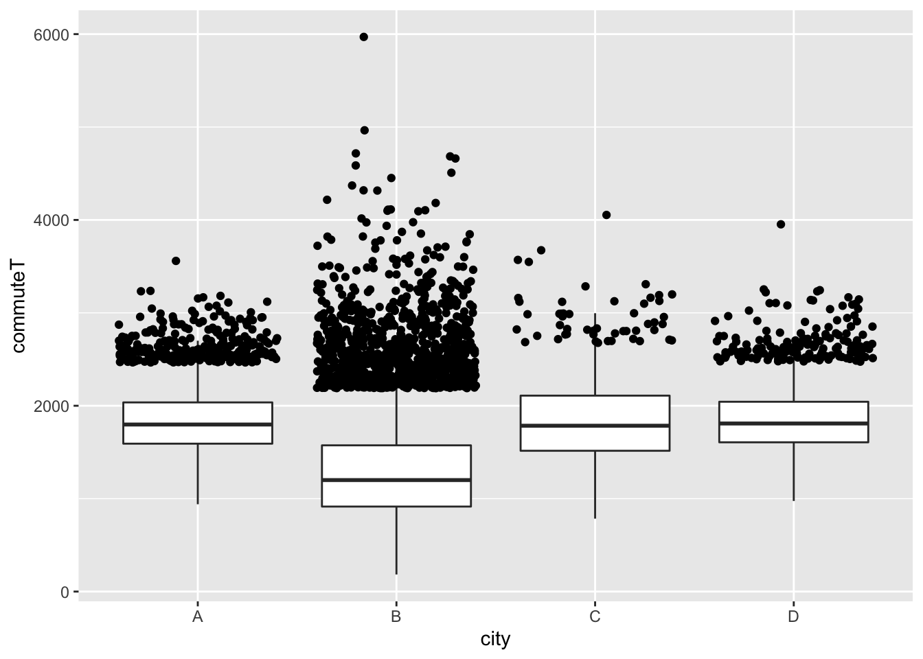
Usually we do not need to change the range of whisker or box, so in this case we’ll leave them alone. But one thing we can observe here is that, the outliers are very close to each other. Because both city A and city B have a lot of samples, with all the outliers crunched together, it is difficult to get a sense on how these outliers are distributed. In order to solve that issue, we can use jitters.
df2 <-
    df_commute %>%
    group_by(city) %>%
    mutate(outlier = commuteT > median(commuteT) + IQR(commuteT) * 1.5) %>%
    ungroup

p2 <- ggplot(df2) +
    aes(x = city, y = commuteT) +
    geom_boxplot(outlier.shape = NA) +  # NO OUTLIERS
    geom_point(data = function(x) dplyr::filter_(x, ~ outlier), position = 'jitter')

print(p2)
change axis to time format
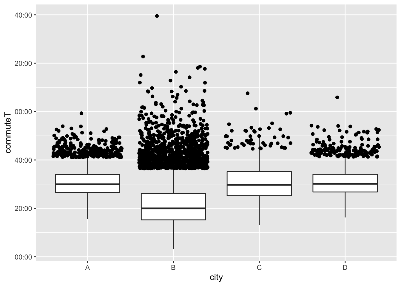
To convert seconds from numbers to hh:mm:ss format, we can use the function hms::as_hms(). When adding this to aes() directly, ie: aes(x = city, y = hms::as_hms(commuteT)), it prints the default “hh:mm:ss” format.
To have more flexibility in formatting, we can create a anonymous function and apply it as a whole to scale_y_time():
format_ms <- function(sec) stringr::str_sub(hms::as_hms(sec), start = 4L, end = 8L)
p2 <- p2 +
    scale_y_time(labels = format_ms)

print(p2)
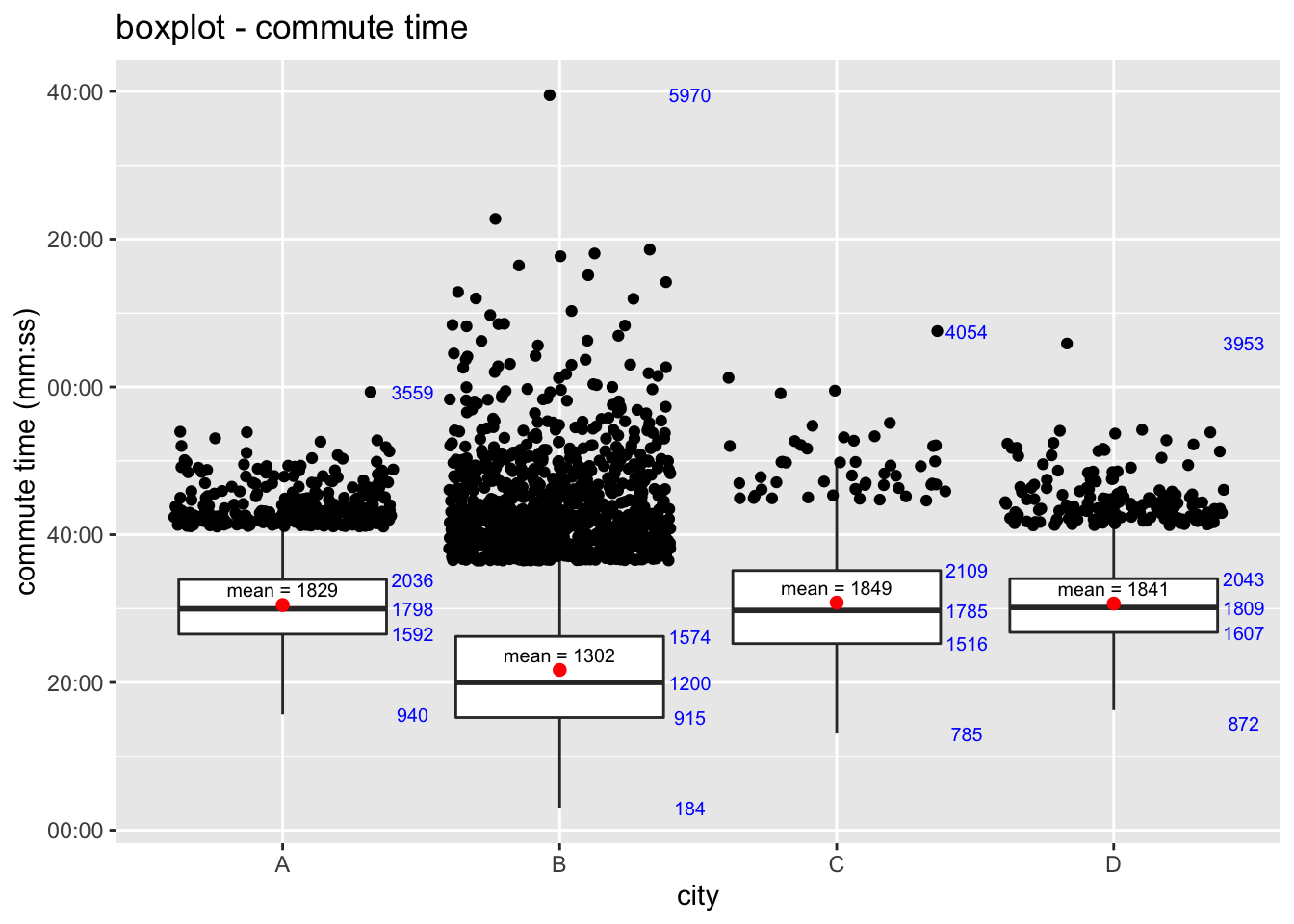
add annotations
To add any annotation, we can use stat_summary(), and apply function to argument fun=, which will show in plot at where the value is. Then use argument position= to adjust the position of annotation:
p3 <- p2 +
    stat_summary(geom="text", fun=quantile,
                 aes(label=sprintf("%1.0f", ..y..)),
                 position=position_nudge(x= 0.47), size=2.6, color = "blue") +
    stat_summary(geom="text", fun=mean,
                 aes(label=sprintf("mean = %1.0f", ..y..)),
                 position=position_nudge(x= 0, y = 125), size=2.6) +
    stat_summary(geom = "point", fun = mean, shape = 20, size = 3, color = "red") +
    ggtitle('boxplot - commute time') +
    ylab("commute time (mm:ss)")

print(p3)
 If you need to reorder the x-axis, one way is to change
 scale_x_discrete(). For instance, to re-order it to be D-C-B-A, add scale_x_discrete(limits = c("D", "C", "B", "A")).